NuvaRing, A Case Study:
Making Medical Instructions Feel Less Medical
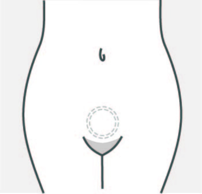
* PLEASE NOTE: This post contains illustrations of female sexual anatomy and may be considered NSFW *
NuvaRing was launched in the early 2000s around the same time I started working as a sexual health educator. It is a flexible ring that is inserted into the vagina where it releases hormones into the body to prevent pregnancy. NuvaRing is worn consistently for 3 weeks and then removed for one week during which a woman menstruates.
I decided to redesign the instructional material for NuvaRing as a part of an information design study for a spring course I took at the School of Visual Arts. I chose the ring largely because of my familiarity and fondness for the product. As medical device instructions don’t have a great reputation for compelling information design, I also saw this as a good design challenge and an opportunity to use materials to improve the overall birth control experience.
Better Instructions, Better Experiences
It is important for manufacturers to design clear, accurate and comprehensive instructional materials so that people can effectively use their birth control. Even better, when designed with the intended user in mind, materials can feel more engaging and supportive to people’s needs. With the potential to reach millions of consumers worldwide, the language and tone of these materials matter because, intentionally or not, they convey beliefs and attitudes about women’s bodies and sexual health. That is, their impact is felt well beyond the individual user.
Instructional materials surface at critical touchpoints in the birth control experience: They help foster a relationship with users, and become a familiar face in the birth control journey. Every time a person receives their birth control, they receive instructional materials. And yet, the design of materials often feels like an afterthought. Despite the sensitive topics they cover, birth control instructions can look and feel no different than materials you receive with an everyday household appliance. They tend to be dense and crammed with fine print, spouting legal disclaimers and warnings about health risks.
While this is all essential information, the way it is communicated can be daunting and (slightly) terrifying, at least from my perspective. Typically I find device instructions to feel highly technical, losing sight of the person at the center of the experience. With female oriented products, it’s particularly important to consider how instructional material can promote sex positivity and challenge stereotypes and stigma around female sexuality.
How might we design clear and inclusive instructions?
The following questions guided me through the redesign:
- How might we design clear, credible and effective instructions?
- How might we design instructions that users from diverse cultural contexts can identify with?
- How might we normalize the relationship between women and their sexual body parts?
- How might we promote sex-positive attitudes about sexual health and behaviours?
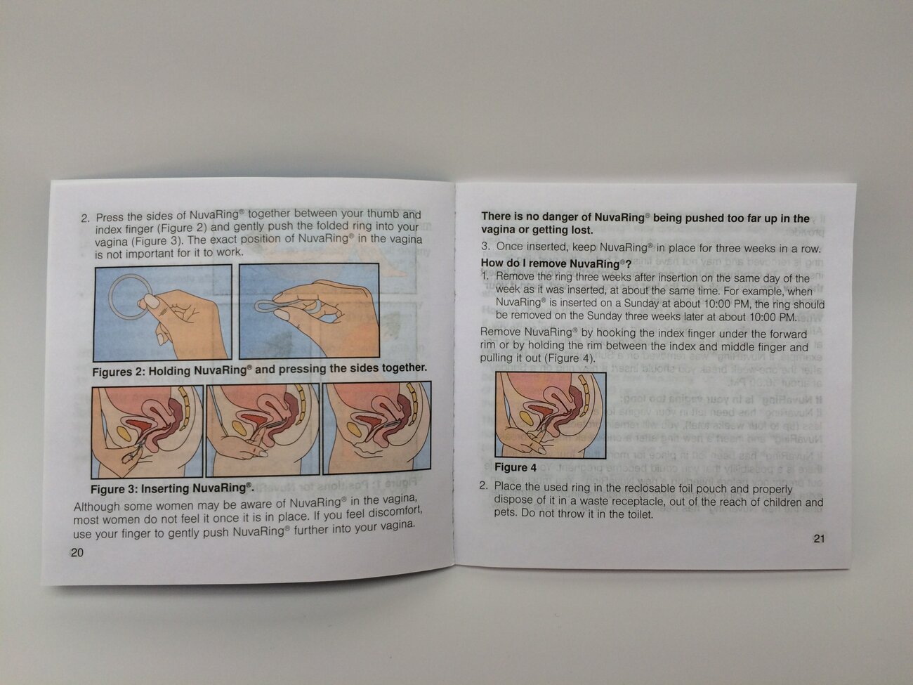
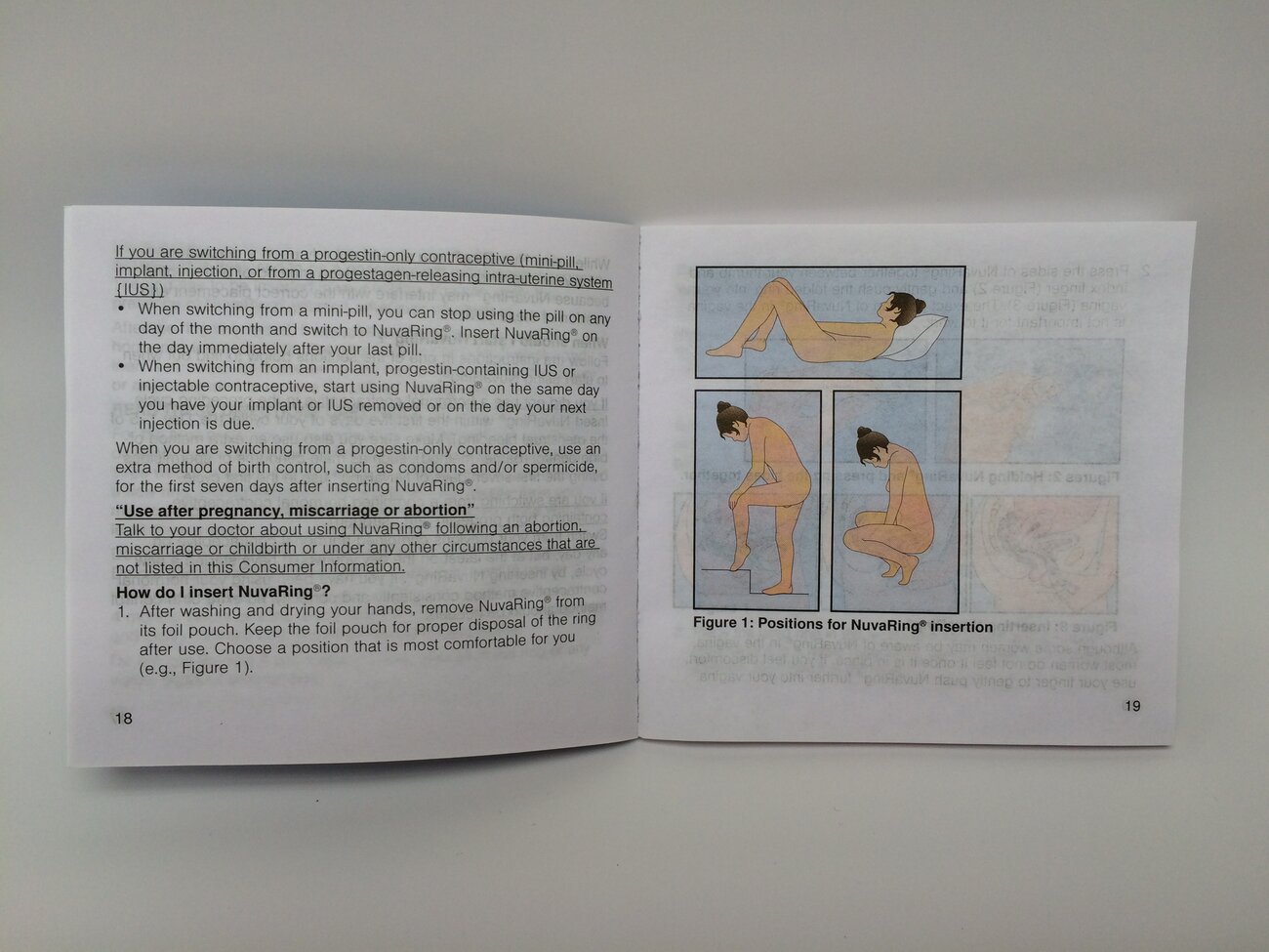
Photos taken from the instruction booklet inside of a NuvaRing package
Reviewing the Manufacturer’s Instructions
Images from the manufacturer’s instructional material are above. My main observations:
- The instructions on using the ring are explained over several pages of the booklet
- Visual and text instruction are interspersed and the formatting of the text is inconsistent
- Illustrations show detailed anatomical cross-sections of the female body, and depict internal organs; the vulva and vaginal opening are not explicitly shown
- There is not a clear distinction between internal and external body parts; parts are not labeled
- Internal and external body parts appear in varying flesh tones
- The woman in the instructions appears to be completely nude; she is shown from her side profile and appears to be looking at her pelvic area
Strengths
The small booklet fits nicely into your hands and the NuvaRing package. Though not directly related to the instructions, the booklet includes reminder stickers for your calendar to insert/remove the ring, which seems thoughtful.
Opportunities for Change
The dense text throughout the booklet made the content feel onerous. The instructions were also difficult to follow without clear sequential steps. Illustration-wise, the relationship between the ring, the woman, and her sexual organs (vulva, vagina) felt disjointed and lacked a clear flow, perhaps in part because the information was spread out over several pages.
The illustrations themselves were also somewhat confusing and off putting: A completely nude person (you don’t need to be naked to insert the ring) and a cross section of the female internal organs. The latter actually reminded me of viewing cadavers in my undergraduate biology courses. To me, these visuals depict a medicalized view of the female body from the perspective of a healthcare provider (HCP) interacting with a patient. You might call this the HCP’s “gaze” or point of view, a lens that comes from a place of great and often undisputed power and privilege. Ultimately, what is missing here is the user’s perspective.
The Redesign
I decided to create a quick reference guide — an at-a-glance guide to using the ring on a routine basis that accompanies a more comprehensive material with all the mandatory “fine print” (this pairing is quite common in the world of medical device materials). I identified and arranged key steps of the instruction and created a range of options for illustrations. Because the average user is not likely to read the instructions in their entirety, I was especially judicious about content design. I had to strike the right balance between the type and amount of information to provide to the user, and when to provide it.
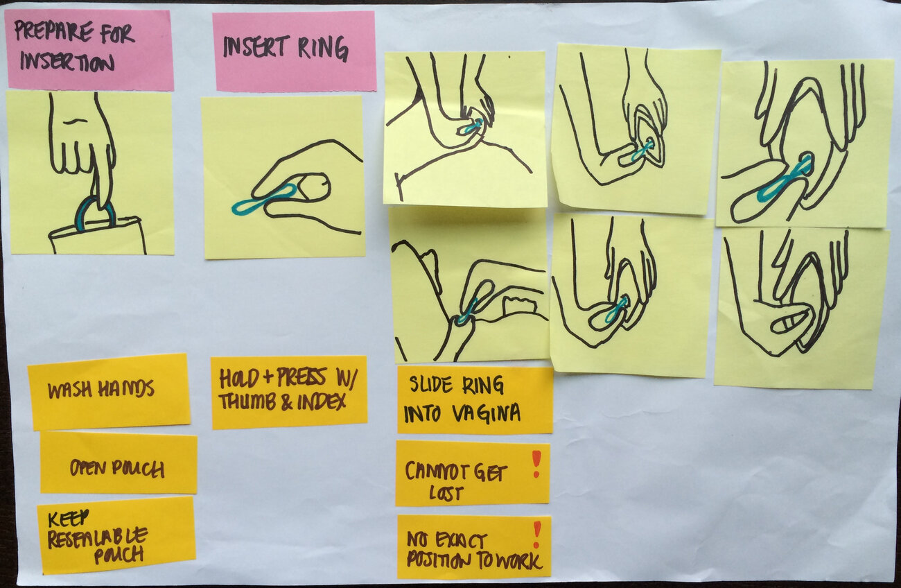
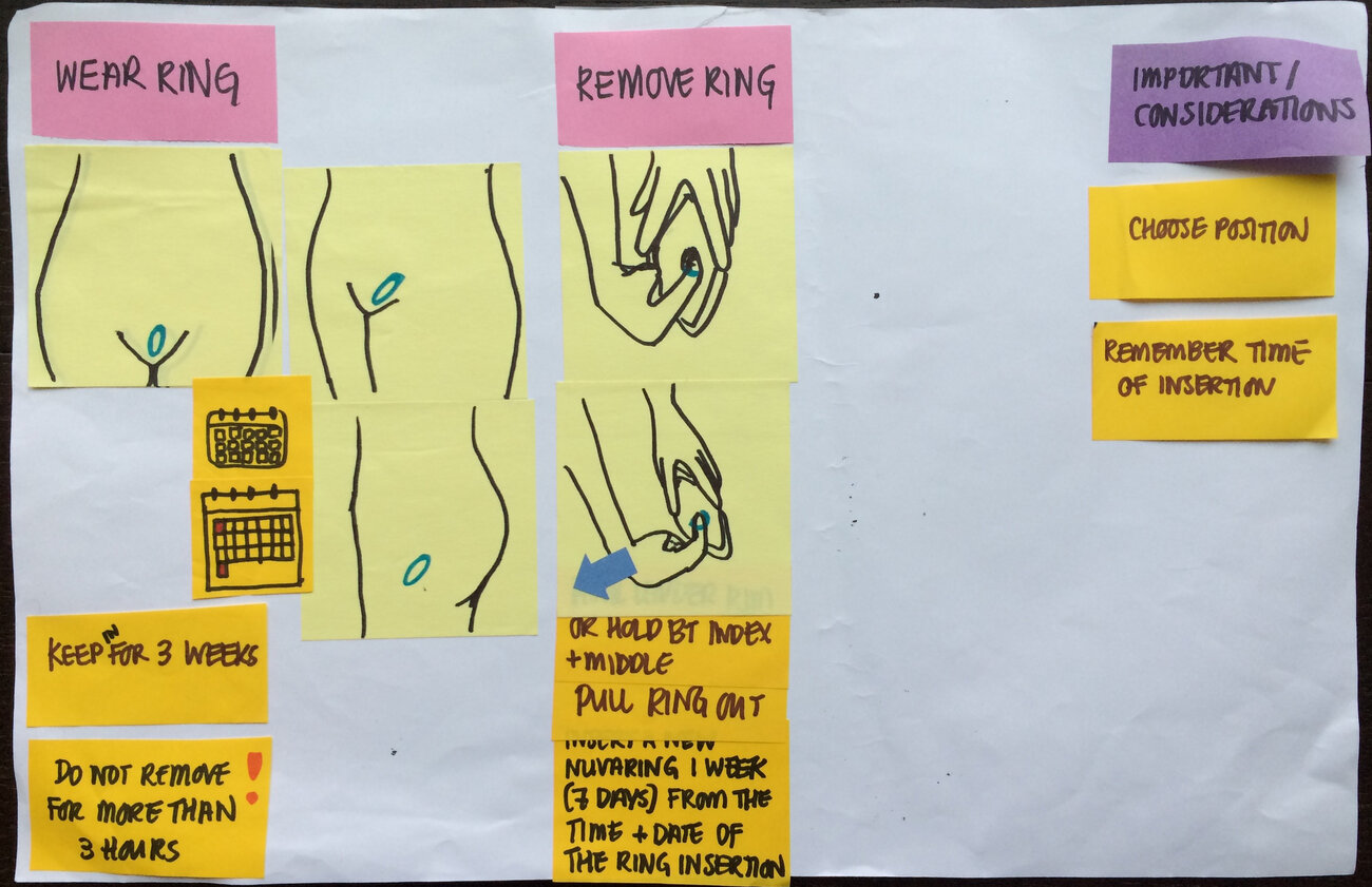
Prototyping the re-designed instruction
As I was prototyping, I found myself grappling with several key issues related to content:
Point of View (POV)
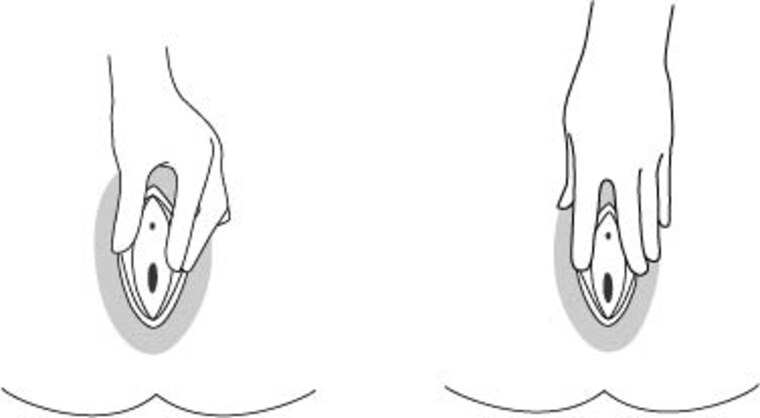
I experimented with several visual POVs for the illustrations. I found that a first person POV (that did not show the vulva) was true to the user experience yet unhelpful in conveying specific instructions, and that a ‘spectator’ POV (a person watching someone else use the ring) came across as somewhat intrusive. For the most part, I decided to use a modified first person POV from the perspective of a woman viewing her vulva in a mirror. I appreciate this POV because it comes from a sex positive place: Mirrors are a source of empowerment for women who want to learn more about their bodies. This vantage point implies that the user has greater control over her experience and that her body is ‘on display’ for her only, which may promote a sense of privacy/intimacy with use of the ring.
Positioning of Hands
I felt it was important to show the user’s hands directly touching her genitals to normalize this interaction; this is otherwise often considered shameful or overtly sexual behavior for a woman. In doing research for this project, I sought out visual references of hands interacting with the vulva. I found most of these references from medical textbooks (view of vulva with a gloved hand touching it) or pornography (view of vulva with a woman touching herself). The intention behind displaying the genitals are quite different: The former is meant to display the female anatomy, often in a diseased state, in a sterile environment for educational purposes, while the latter is intended to showcase the genitals with the aim of stimulating sexual arousal. There is a complex history and interesting crossover between these representations of the female genitalia that Kapsalis thoughtfully discusses in her book, Public Privates. This was helpful food for thought when considering how to represent the vulva.
For the instructions, I envisioned showing one hand inserting the ring and the other spreading the labia to facilitate easier access to the vagina. However, in sifting through my visual references for the latter, the only consistent “methods” came from porn (e.g., using the index and middle fingers to create a “V” shape). I chose not to explicitly draw from any specific references and, rather, settled on a hand position that I felt was realistic and practical.
Representations of the Body
I took a multi-pronged approach to developing simple and inclusive illustrations and language that would resonate with a diverse user audience.
- Avoiding the use of female gender pronouns: I debated this because being a woman is likely a very powerful and important part of most users’ identity, however, I did not want to exclude those who may not identify as female.
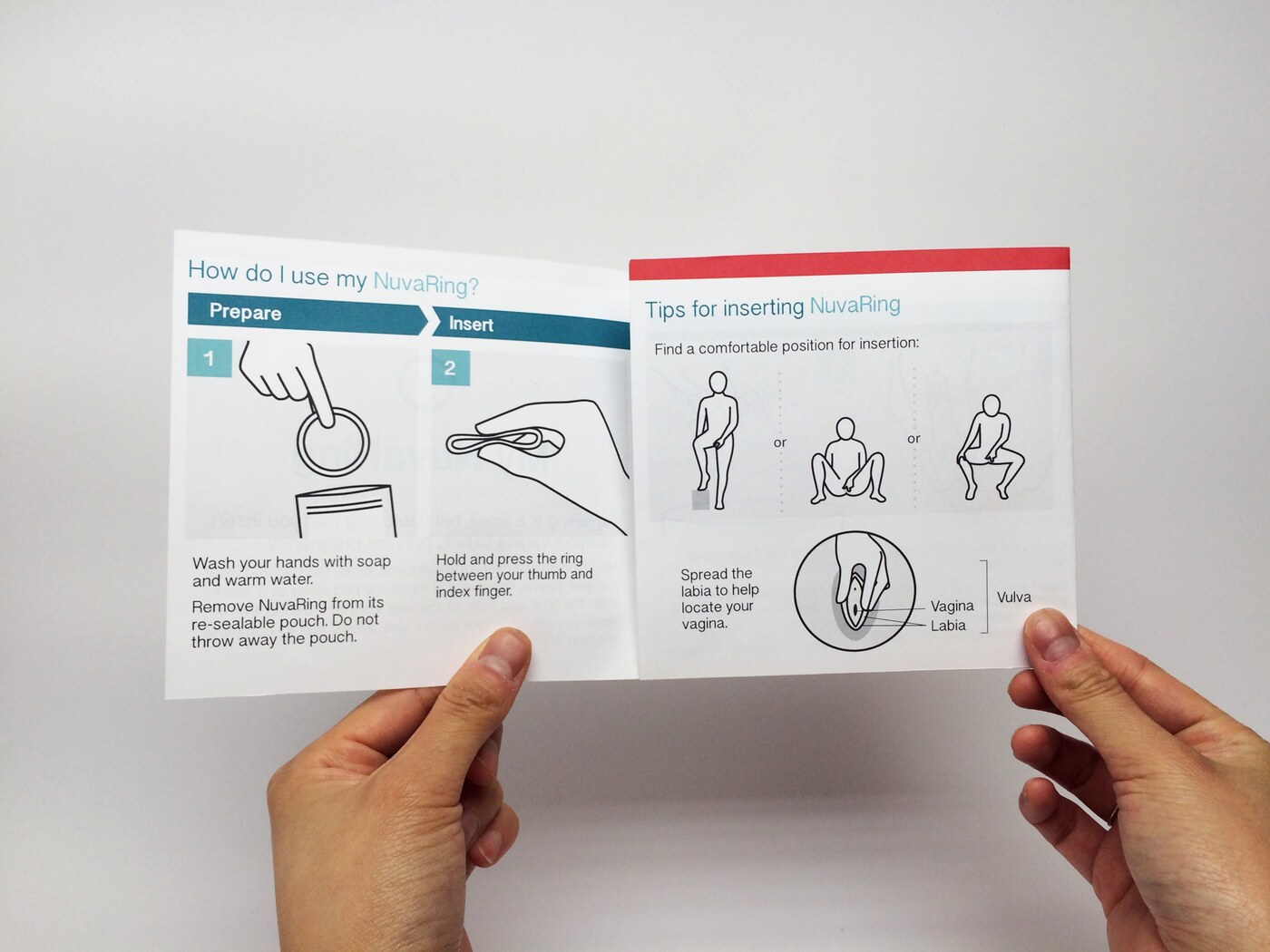
- Simplifying illustrations: I removed parts of the body that were not critical to the instruction to minimize distraction and confusion. This forced me to prioritize and determine to what extent to include body parts (e.g., do I show the anus? urethra?) and why (e.g., for reference? educational purposes?). For instance, when showing the vulva and vaginal opening, I decided to include the urethra and labia minora and majora as key visual references.
- Strategic use of color: I selectively used color throughout the illustrations to emphasize certain instructions and neutralized skin tones to make them more inclusive. I also shaded the labia to suggest pubic hair. As a natural and normal feature of the body, I felt it was important to include so long as it did not interfere with the illustrations. The absence of pubic hair may otherwise suggest that a person is pre-pubescent or has intentionally removed their hair.
Final Product
Here’s a summary of the major changes I made in the redesign:
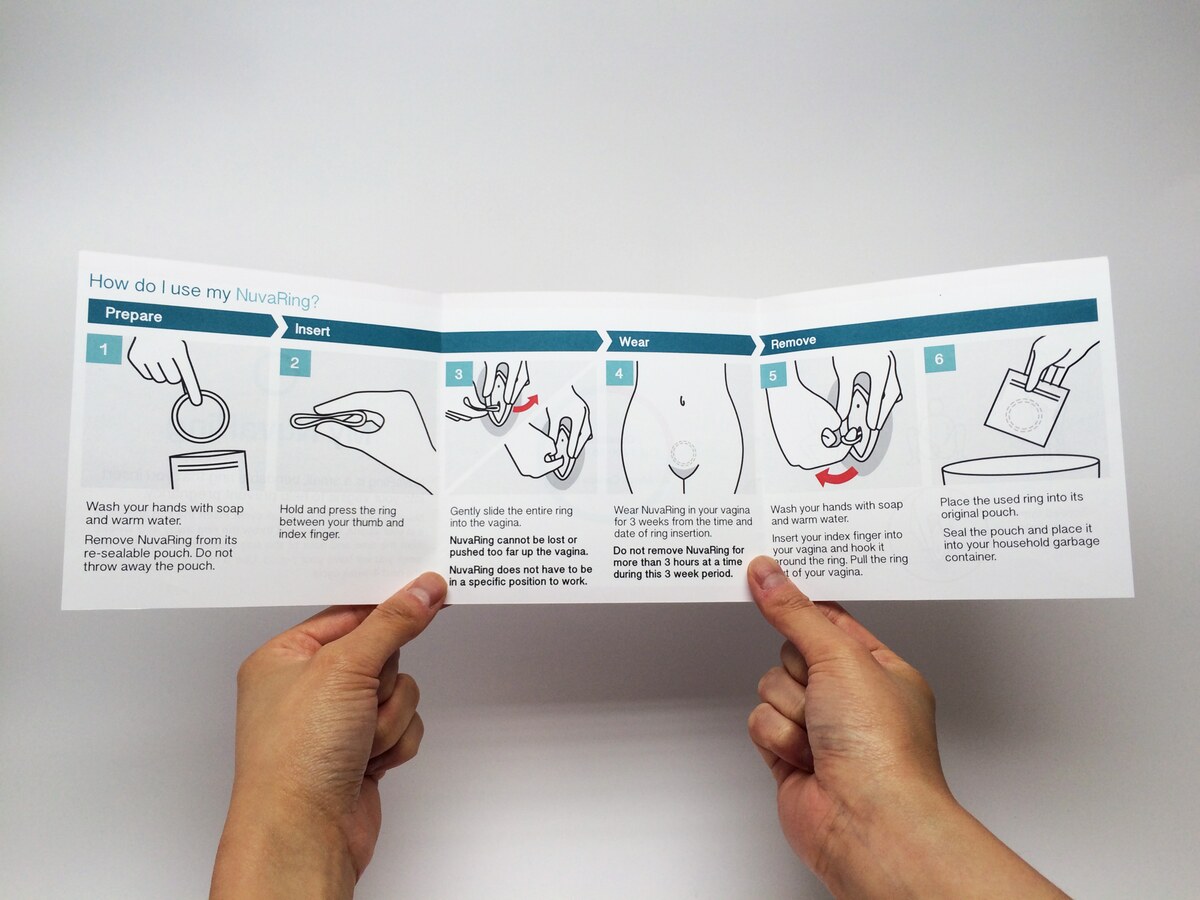
- Created a square QRG that would fit into the package alongside the ‘fine print’
- Illustrations have minimal detail and most are drawn from the perspective of a woman viewing her body in a mirror
- Instructional steps are numbered and organized into four major stages of use (prepare, insert, wear, remove)
- Visuals and plain-language text are paired in a linear sequence
- Body parts relevant to the instruction are labeled for educational purposes
- Gender neutral figures shown explicitly touching their genitals demonstrate different positions for ring insertion
- Skin tones are neutralized so they are more inclusive; shading applied to the vulva area is a reference to pubic hair
- Color is used to highlight key actions (arrows)
- Introduced a friendly logo and color palette, aligned with brand colors
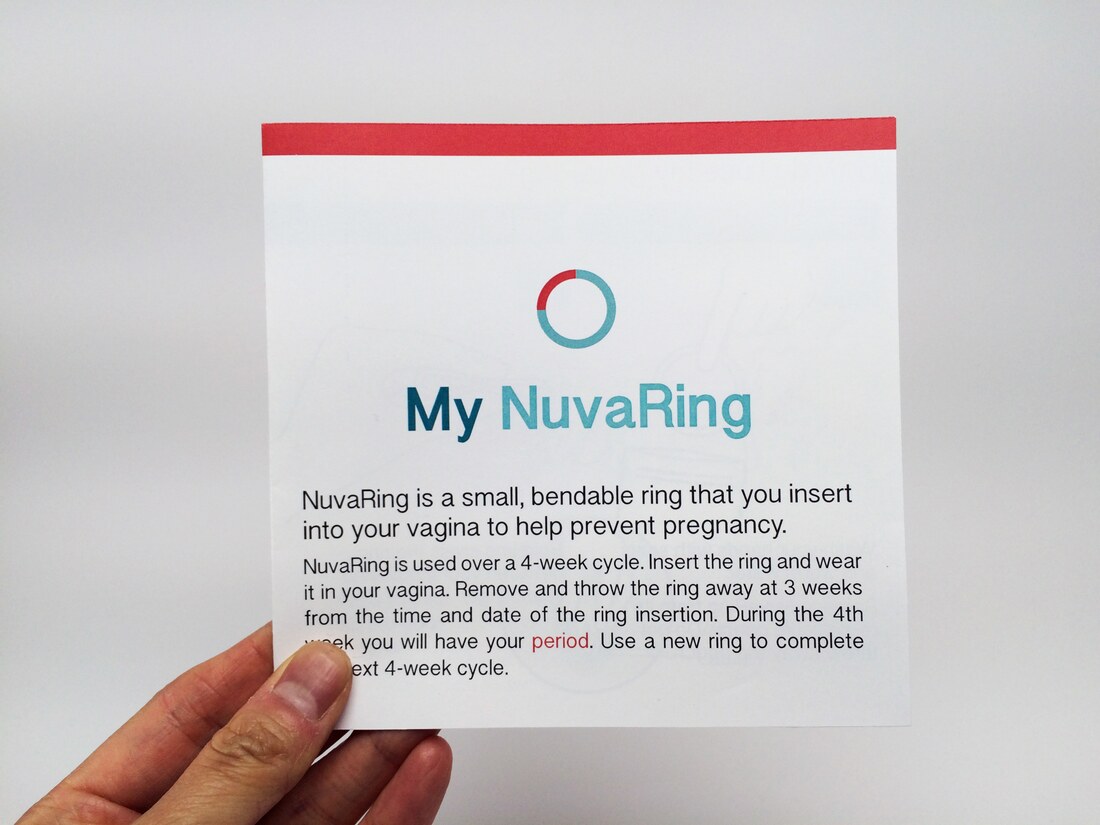
A fresh re-design
Next Steps
There are already changes I could imagine making to this iteration of the guide (e.g., including info like Q&As and health warnings, etc.), but it is a starting point. The true test of this material would be in usability testing (if that were to ever happen).